
Vibrant Citrus Color Palette
Discover the Vibrant Citrus color palette, featuring warm yellows, soft pinks, and calming blues. Perfect for branding, interiors, and weddings.

The Vibrant Citrus color palette exudes warmth and energy, perfect for creating a lively atmosphere in branding, interiors, and weddings. The combination of bright yellows, soft pinks, and calming blues evokes feelings of happiness and playfulness. Use this palette to add a pop of color to your designs and make a lasting impression.
Color codes in this palette
| Swatch | HEX | RGB |
|---|---|---|
Palette analysis: how to use Vibrant Citrus Color Palette
This 6-color palette is vivid, high-saturation and warm-leaning (5 warm, 1 cool).
Its lightest tone is #F5DF58 (light yellow) and its darkest is
#B19E6F (yellow), a contrast range of
1.95:1.
None of its color pairs reach the WCAG AA 4.5:1 ratio for body text, so pair it with near-black (#111111) or white text for anything people need to read, and keep the palette for backgrounds, illustrations and accents.
Every color in HEX, RGB, HSL and CMYK
| Color | Tone | HSL | CMYK | On white | On black |
|---|---|---|---|---|---|
#F4DB10 | yellow | hsl(53, 91%, 51%) | 0, 10, 93, 4 | 1.40:1 Fail | 14.99:1 AAA |
#F5DF58 | light yellow | hsl(52, 89%, 65%) | 0, 9, 64, 4 | 1.35:1 Fail | 15.58:1 AAA |
#C9AA19 | yellow | hsl(49, 78%, 44%) | 0, 15, 88, 21 | 2.27:1 Fail | 9.25:1 AAA |
#B19E6F | yellow | hsl(43, 30%, 56%) | 0, 11, 37, 31 | 2.63:1 Fail | 7.99:1 AAA |
#ABBDD1 | muted light blue | hsl(212, 29%, 75%) | 18, 10, 0, 18 | 1.92:1 Fail | 10.93:1 AAA |
#ECA6DC | light magenta | hsl(314, 65%, 79%) | 0, 30, 7, 7 | 1.90:1 Fail | 11.05:1 AAA |
CMYK values are a mathematical conversion for reference; ask your printer for a profile-based match before a print run. Contrast ratios use the WCAG 2.2 relative-luminance formula: 4.5:1 is the minimum for normal text (AA), 3:1 for large text and UI components, and 7:1 for AAA.
Accessible text pairings within the palette
The strongest pair is #F5DF58 with #B19E6F at 1.95:1, which is below every WCAG text threshold, so treat these colors as decorative.
Suggested roles for a website or app
- Background / surface:
#F5DF58, the lightest tone, keeps large areas calm. - Body text:
#111111(14.01:1 on the background). - Primary / call-to-action:
#F4DB10, the most saturated color, draws the eye to buttons and links. Use dark button labels on it. - Secondary:
#C9AA19for cards, tags and section bands. - Accent / details:
#B19E6Ffor dividers, icons and highlights.
A practical split is the 60-30-10 rule: about 60% surface color, 30% secondary, and 10% primary accent, so the call-to-action color stays rare enough to stand out.
Copy-ready code
Tailwind CSS (tailwind.config.js → theme.extend.colors):
'vibrant-citrus': {
  primary: '#F4DB10',
  secondary: '#C9AA19',
  accent: '#B19E6F',
  surface: '#F5DF58',
  ink: '#111111',
}
SCSS variables:
$vibrant-citrus-primary: #F4DB10;
$vibrant-citrus-secondary: #C9AA19;
$vibrant-citrus-accent: #B19E6F;
$vibrant-citrus-surface: #F5DF58;
$vibrant-citrus-ink: #111111;
Need more? Build a smooth background with our CSS gradient generator, check how these colors look to people with color vision deficiency in the color blindness simulator, or find the closest CSS named color with the color name finder.
Gradient from this palette
background: linear-gradient(135deg, #F4DB10, #F5DF58, #C9AA19, #B19E6F, #ABBDD1, #ECA6DC);
Tints & shades
Lighter and darker variations of each color — click any swatch to copy.
More palettes

Coastal Mediterranean Color Palette
#B75B2E · #E6C098 · #66230A · #A1826D · #CEACAD

Tropical Night Color Palette
#069DD4 · #E8B167 · #74080C · #A85478 · #DCD2BA

Citrus Burst Color Palette
#E3C00E · #F0D974 · #057D89 · #9D9860 · #BDC09B
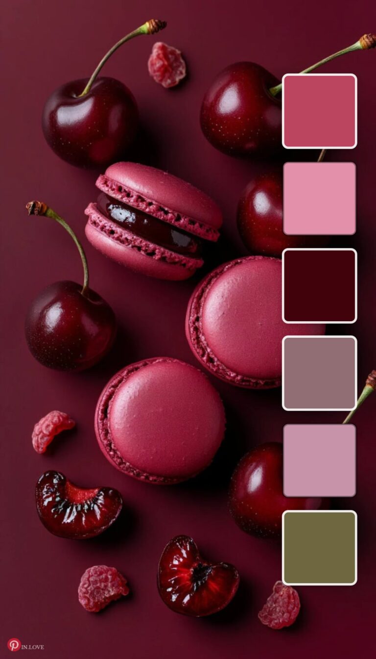
Rich Berry Color Palette
#BB445F · #E391AA · #42020B · #916E74 · #C793A9
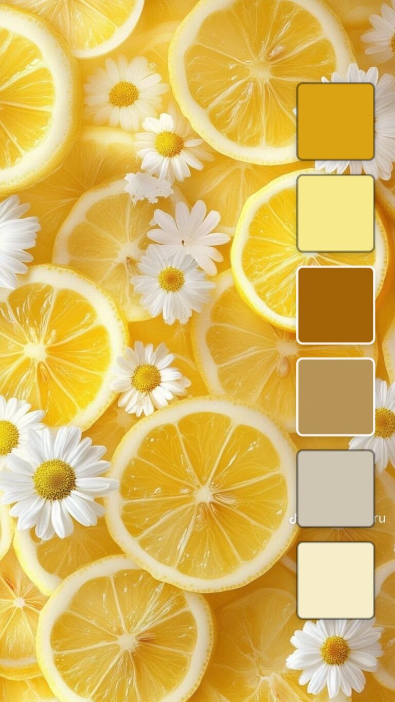
Vibrant Citrus Color Palette
#DAA314 · #F7EA8C · #A26407 · #B69458 · #CFC5B3
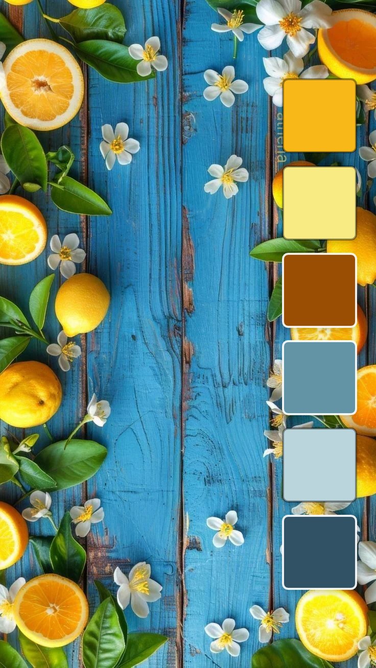
Citrus Bloom Color Palette
#F8B918 · #F9EB84 · #9A4E03 · #6394A6 · #BAD5DC
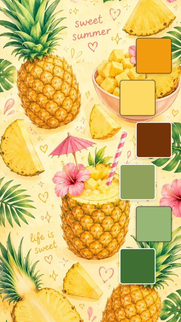
Pineapple Summer Color Palette
#F19C0F · #FCDA64 · #743408 · #90A15C · #96B776

Coastal Bloom Color Palette
#0EA0B9 · #EE8A9A · #0791AD · #6B979B · #96C5C7