
Citrus Oasis Color Palette
Discover the Citrus Oasis color palette, a refreshing blend of orange, teal, and pink hues perfect for branding, interiors, and design projects.

The Citrus Oasis color palette exudes a refreshing and vibrant mood, perfect for summer branding, tropical interior design, or wedding themes. The combination of warm orange tones (#F19F16, #EDD29B) with calming teal hues (#05556F) and soft pink accents (#B96186, #C6A896) creates a unique and captivating visual experience. Use this palette to add a pop of color to your UI design, packaging, or marketing materials.
Color codes in this palette
| Swatch | HEX | RGB |
|---|---|---|
Palette analysis: how to use Citrus Oasis Color Palette
This 6-color palette is medium-saturation and warm-leaning (5 warm, 1 cool).
Its lightest tone is #EDD29B (light sand) and its darkest is
#434427 (deep olive), a contrast range of
6.82:1.
4 of the 15 possible color pairs pass WCAG AA for body text, so you can build readable text directly from the palette.
Every color in HEX, RGB, HSL and CMYK
| Color | Tone | HSL | CMYK | On white | On black |
|---|---|---|---|---|---|
#F19F16 | orange | hsl(38, 89%, 52%) | 0, 34, 91, 5 | 2.16:1 Fail | 9.71:1 AAA |
#EDD29B | light sand | hsl(40, 69%, 77%) | 0, 11, 35, 7 | 1.47:1 Fail | 14.29:1 AAA |
#05556F | deep cyan-blue | hsl(195, 91%, 23%) | 95, 23, 0, 56 | 8.28:1 AAA | 2.54:1 Fail |
#B96186 | pink | hsl(335, 39%, 55%) | 0, 48, 28, 27 | 4.10:1 AA Large | 5.12:1 AA |
#C6A896 | light tan | hsl(23, 30%, 68%) | 0, 15, 24, 22 | 2.22:1 Fail | 9.44:1 AAA |
#434427 | deep olive | hsl(62, 27%, 21%) | 1, 0, 43, 73 | 10.02:1 AAA | 2.09:1 Fail |
CMYK values are a mathematical conversion for reference; ask your printer for a profile-based match before a print run. Contrast ratios use the WCAG 2.2 relative-luminance formula: 4.5:1 is the minimum for normal text (AA), 3:1 for large text and UI components, and 7:1 for AAA.
Accessible text pairings within the palette
Suggested roles for a website or app
- Background / surface:
#EDD29B, the lightest tone, keeps large areas calm. - Body text:
#434427(6.82:1 on the background). - Primary / call-to-action:
#05556F, the most saturated color, draws the eye to buttons and links. Use white button labels on it. - Secondary:
#F19F16for cards, tags and section bands. - Accent / details:
#B96186for dividers, icons and highlights.
A practical split is the 60-30-10 rule: about 60% surface color, 30% secondary, and 10% primary accent, so the call-to-action color stays rare enough to stand out.
Copy-ready code
Tailwind CSS (tailwind.config.js → theme.extend.colors):
'citrus-oasis': {
  primary: '#05556F',
  secondary: '#F19F16',
  accent: '#B96186',
  surface: '#EDD29B',
  ink: '#434427',
}
SCSS variables:
$citrus-oasis-primary: #05556F;
$citrus-oasis-secondary: #F19F16;
$citrus-oasis-accent: #B96186;
$citrus-oasis-surface: #EDD29B;
$citrus-oasis-ink: #434427;
Need more? Build a smooth background with our CSS gradient generator, check how these colors look to people with color vision deficiency in the color blindness simulator, or find the closest CSS named color with the color name finder.
Gradient from this palette
background: linear-gradient(135deg, #F19F16, #EDD29B, #05556F, #B96186, #C6A896, #434427);
Tints & shades
Lighter and darker variations of each color — click any swatch to copy.
More palettes

Tropical Oasis Color Palette
#F8C44F · #F6959E · #1A6174 · #52A094 · #9BCCCC

Warm Sunset Color Palette
#C75605 · #F0B2CE · #962A06 · #9E8263 · #C6A794

Citrus Oasis Color Palette
#3DC1DA · #E8C893 · #093D6D · #56899E · #C8B990

Refreshing Summer Color Palette
#066DE9 · #F9CC72 · #01358D · #5980A3 · #AAC2D4
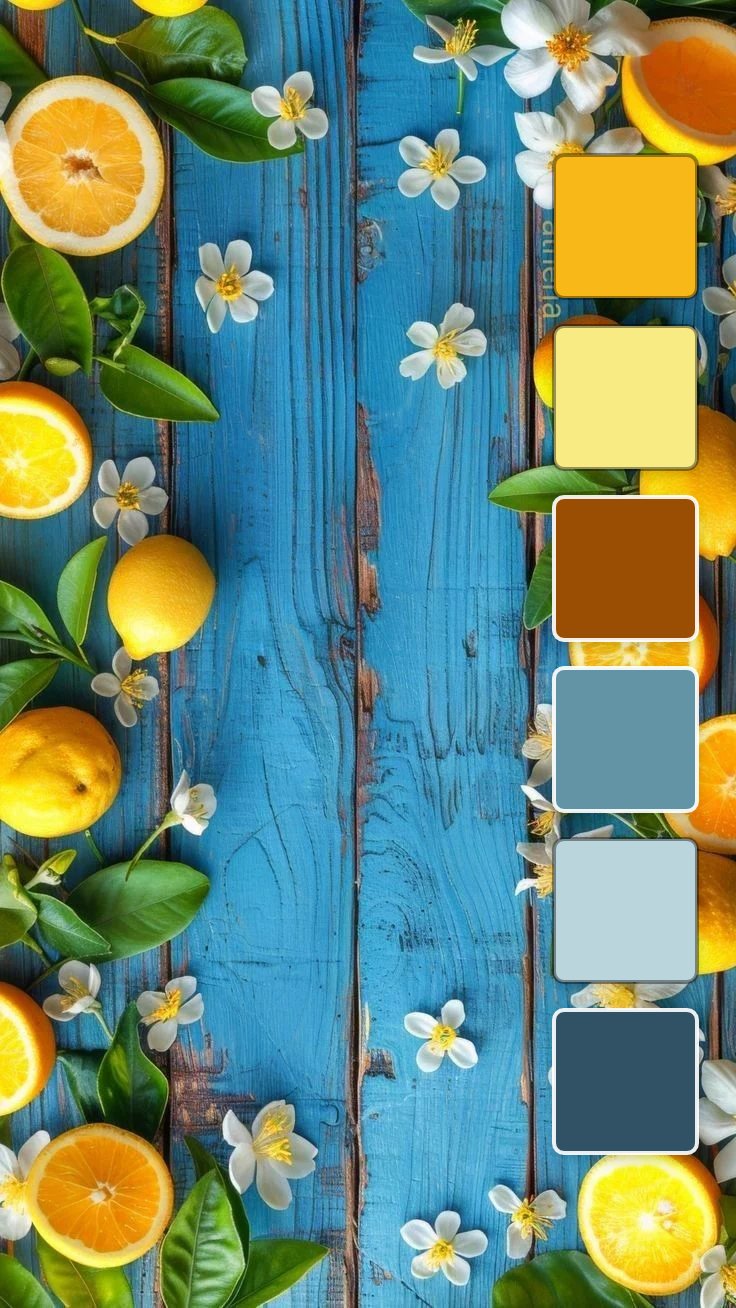
Citrus Bloom Color Palette
#F8B918 · #F9EB84 · #9A4E03 · #6394A6 · #BAD5DC

Tropical Oasis Color Palette
#F4AA1C · #F6CC8E · #0E958D · #59B0AC · #A1C6C0

Blush Teal Office Color Palette
#197A94 · #F190BD · #09637D · #707E86 · #ABC9D5

Coastal Bloom Color Palette
#EBA82E · #F6C957 · #AD0E2D · #4AABAC · #97C4C9